10 Commandments of UI Design
Successful User Interface (UI) design within the web development process extends beyond the boundary of visual aesthetics into the ways a user interacts with your website. However, the field of UI design, in the context of integrated marketing and advertising, can be a tough nut to crack.
“Like all forms of design, visual design is about problem-solving, not about personal preference or unsupported opinion.” — Bob Baxley
Awesome UI design is like a conversation. At our marketing agency, we call it progressive communications spanning multiple devices, environments, and connectivity to communicate the brand and positioning. Not only do you need to provide amazing content, but also implement an impeccable user flow. It’s about maximizing the personal connection and individual perceived beauty (engagement) and utility (relevance) of your site across a wide variety of platforms while still meeting the needs of your users.
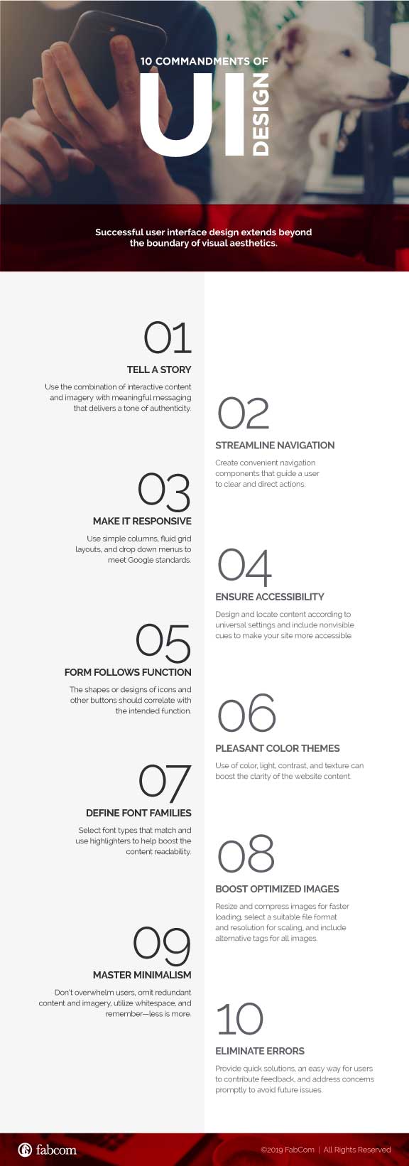
Take the following UI design standards into account to ensure maximum UI success:
- Tell a Story Use the combination of imagery and interactive content with meaningful messaging that delivers a tone of authenticity.
- Streamline Navigation Create convenient navigation components, such as using icons and providing buttons, that guide a user to clear and direct actions.
- Make it Responsive Use simple columns, fluid grid layouts, and drop down menus to meet Google standards.
- Ensure Accessibility Design and locate content according to universal patterns/settings and include nonvisible cues such as labeled links and image alternate text to make your site more accessible.
- Form Follows Function The shapes or designs of icons and other buttons should correlate with the intended function.
- Use Pleasant Color Themes The use of color, light, contrast, and texture can boost the clarity of the website content. It is best practice to select three main colors and complement them with tints, shades, and other hues.
- Define Font Families Deciding font types and combinations can be tricky. Select font types that match and use highlighters to help boost the content readability.
- Boost Optimized Images Resize and compress images for faster loading, select a suitable file format and resolution for scaling, and include alternative tags for all images to help search engines identify the content correctly.
- Master Minimalism To achieve the desired level of minimalism don’t overwhelm users, omit redundant content and imagery, utilize whitespace, and remember—less is more.
- Eliminate Errors Errors can be taken more lightly if quick solutions are made available. Provide an easy way for users to contribute feedback and address their concerns promptly to avoid future issues.
For more strategic talk about UI design, give us a call at 480.478.8500.


